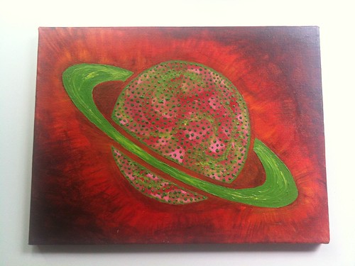
In part 3 of our 5 part series, we feature Planet Argon, by Allison Beckwith.
13 Jul 2010
13 Jul 2010
12 Jul 2010
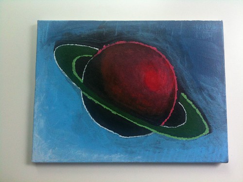
We recently got together as a team to work on an art project. The goal for this project was for each of us to paint our own Planet Argon logo. Allison started us off by tracing our logo on five blank canvases with pencil. She then tossed acrylic paint supplies on the floor and said have fun.
Over each of the next five days, we’ll share each of ours.
Today, we feature Planet Argon, by Ryan Gensel
12 Jul 2010
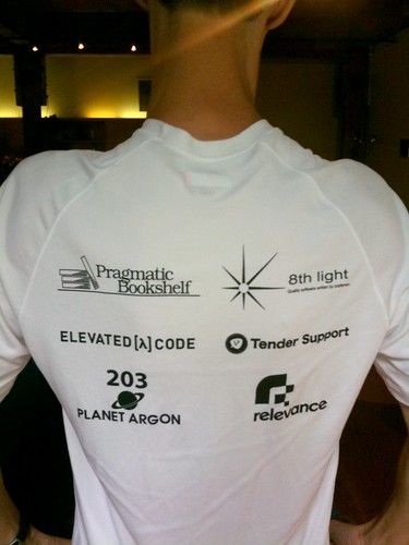
Last year we were happy to sponsor (and participate) in the RubyConf5k. We helped sponsor t-shirts, which meant we’d have our logo included on the back of the shirt.
On the morning of the race, I was looking at the freshly-printed shirts and noticed, “203” above our logo. What did this mean? After a few minutes, I realized that this was our studio’s suite number!
So… the backstory.
On the day that we needed to send over the logo, Allison was out of the studio. I decided to look for a file myself and began rummaging through the Dropbox where our InDesign files are located in search of a B&W graphic with our logo in it. Apparently, the file I found had the number 203 at the top of the image but I completely missed that when opening it up.
Lesson learned? Always have someone else double-check something before it ends up being printed on the back of a t-shirt. :-)
9 Jun 2010
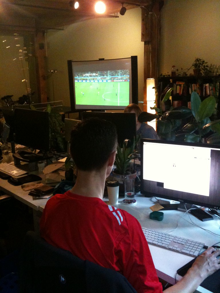
It doesn’t seem like it was very long ago that our team was helping build and launch a web application for the 2006 World Cup for Nike, but it’s been over four years. The last time the matches aired, we didn’t consist of many (soccer) fans, but that’s changed!
Over the coming weeks… I’m sure the World Cup matches will dominate the presence on the projector screen.
6 Jun 2010

Our healthcare provider’s employer web interface for making online payments is using the latest in web technology…
My favorite is that the, “Macintosh Platform can not support the site” versus… they haven’t taken the time to support the Macintosh platform.
3 Jun 2010

While attempting to pay my cable internet bill… I found myself faced with Comcast’s sign in screen. I can’t help but wonder how much effort went into branding their sign in process with mySIGN-IN. Does their online account system really need a branded name (that you then have to explain what it is?) when they could probably suffice with, “Sign into your Comcast online account.” Not only that, someone had to design the graphics. Someone(s) had to approve the lower case “my” and the all-caps SIGN-IN. I’m baffled. The end-result? I wasn’t able to sign in with my email and password… and am now waiting for them to send me a PIN via snail-mail, which is something I’ll write about another time.
28 Mar 2010

I came across this while signing up for a free trial account of Xero. A nice alternative to the annoying captcha.
1 Mar 2010

Was going through some of our photo archives and found this gem.
designer: Allison Beckwith
developer: Graeme Nelson
18 Feb 2010
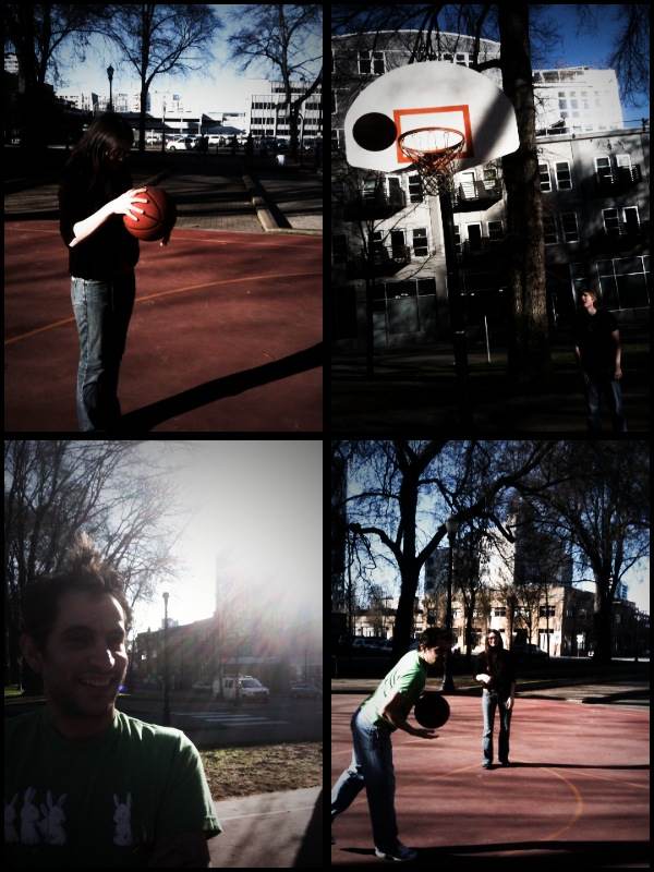
Our new studio is located directly across the street from a few basketball half-courts. The sun has come out over the past few days and we’ve been taking advantage of this. If you’re in the Pearl District, you might discover a few of us playing 2v2 matches and HORSE in the afternoons.
Have a project that needs help?