When You Build Fast, People Get Lost: Rethinking My Steward Registry's Onboarding Journey
Reading time: ~ 6 minutes
There's a quiet cost to building a product in public and improving it quickly. You ship a new feature, you're proud of it, and you move on to the next one before you've really asked how anyone is supposed to find the thing you just made. The features pile up faster than the map to reach them. My Steward Registry hit exactly that point.
For context, My Steward Registry is a vehicle records website that helps users do two things: catalog the history of their vehicle through a well-designed, service-record timeline/story-based approach and list those vehicles for sale. The heart of this site is documentation and story.
We had done work we were genuinely proud of, and yet new users kept walking right past it.
We pointed to them, sure, but a button in the upper-right corner only points- it doesn't guide anyone, and that was the whole problem.
So I took on a mission to walk the user's journey from the very first step to the moment they create their first full record on the site, one continuous path seen through the eyes of someone who had never been here before.
Two things I wanted the journey to do
Before touching any screens, I anchored the work to two ideas.
- Collect the important information quickly, so the record feels full the moment a user lands on the page that displays it. An empty garage is a discouraging thing to arrive at. If someone has just told us their vehicle's make, model, color, and uploaded a photo or two, the page they see next should reflect that effort back to them.
- Make each step feel like an accomplishment. My Steward Registry has a lot of pages, and creating a complete record touches several of them. Without a sense of progress, that length becomes a reason to quit. If each step didn't feel personal, interesting, and worth the thirty seconds it took, we'd lose people in the middle.
Following the path, surface by surface
The journey turned out to span three distinct surfaces. Each one needed its own attention while still feeling like part of the same trip.
It starts on the homepage, where "Claim your vehicle" is the primary call to action. Behind that button used to sit a set of loosely connected screens that were never designed as a single guided experience, so we reshaped them into one flow and deliberately held off on asking for vehicle records until the user had already seen the value:
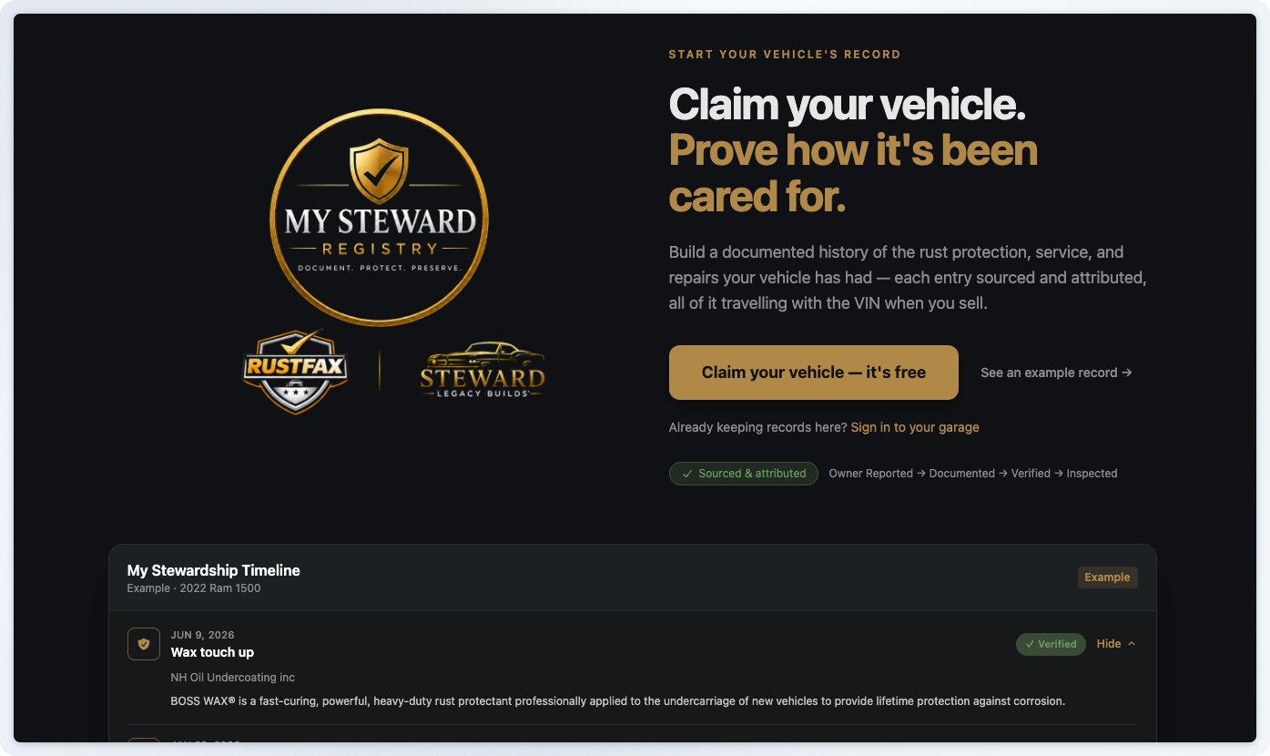
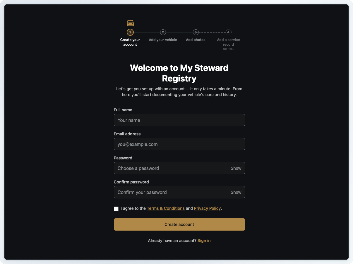
A first-time visitor feels the value before committing, and the progress rail at the top keeps the whole path visible. Signing up reads as one step in a sequence they can already see the end of, not a leap into an empty dashboard.
The next two steps are where the record fills itself in. Take the add-vehicle step — it used to be a single flat form, every field stacked together with no sense of where you were or what actually mattered.
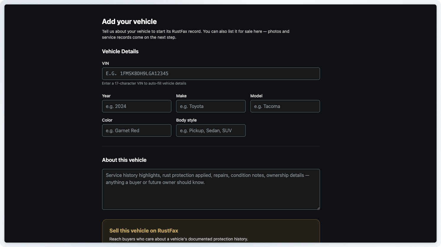
Now the same step opens as a set of clear "to do" sections that spell out what's required and what can wait.
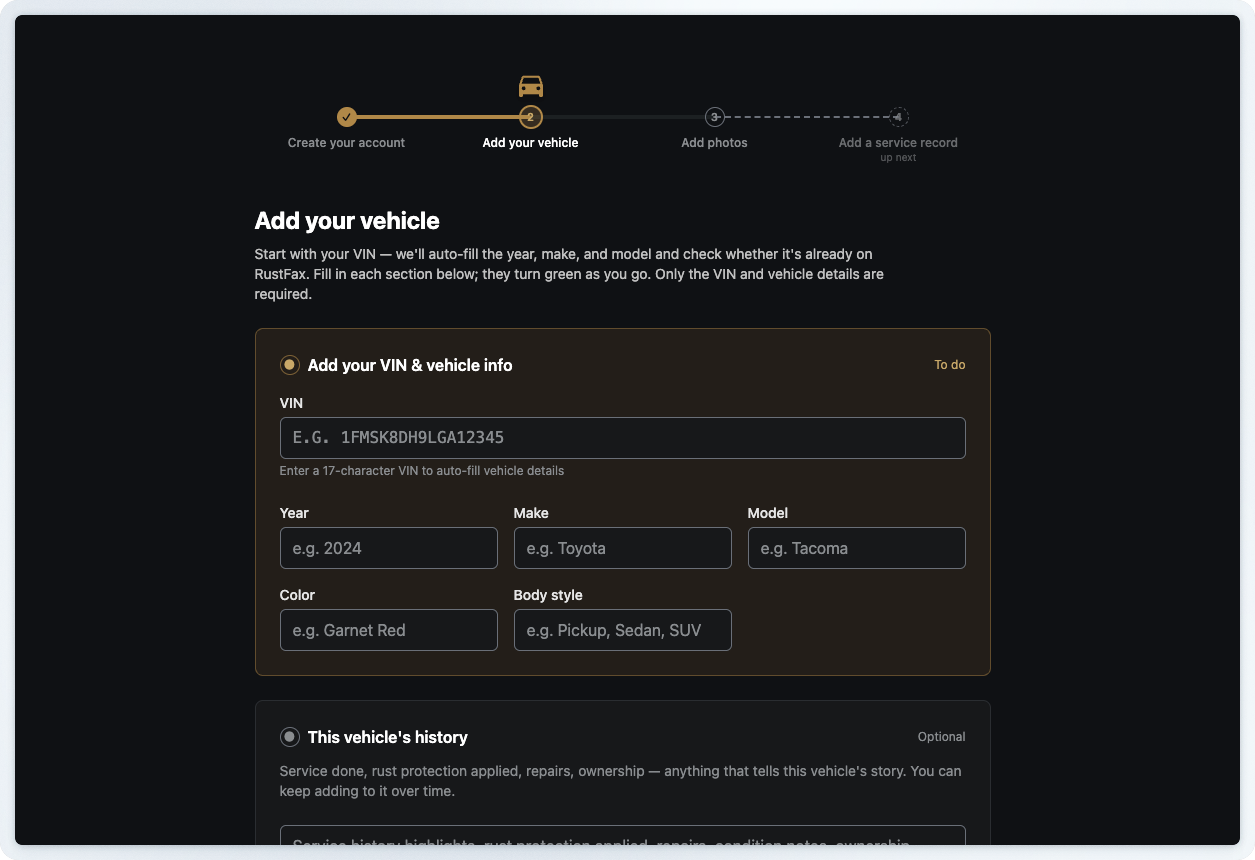
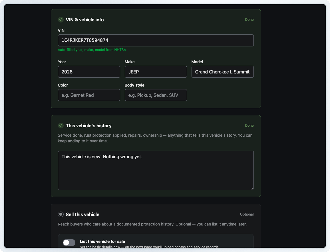
Enter a VIN and the year, make, and model auto-fill from a public national database, with each section turning green as it's done. A near-empty form becomes a near-complete one with barely any typing, so the record feels full before the owner has done much at all.
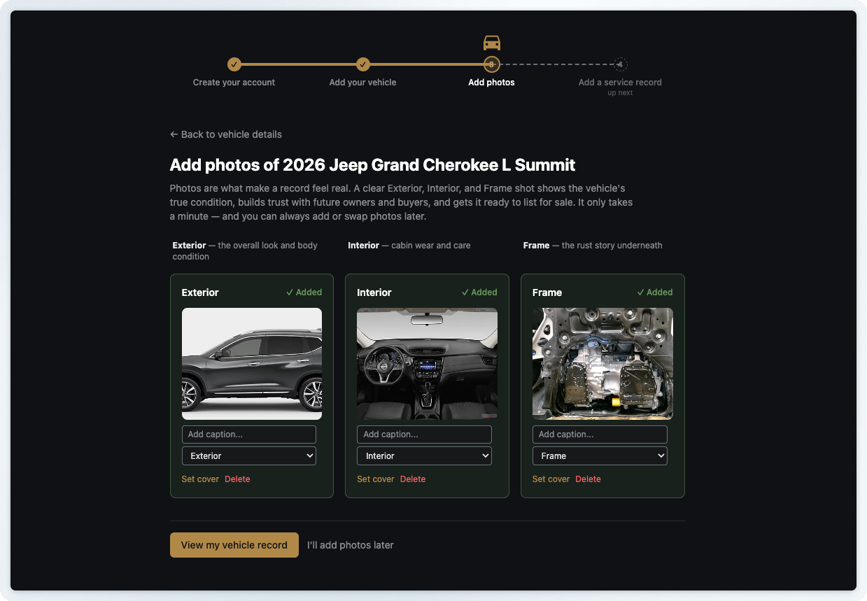
Then, the photos, which make a record feel real. Exterior, interior, and undercarriage shots turn a page of fields into a vehicle someone has clearly cared for.
From there, the path leads to the vehicle record page itself. The old version stacked everything into one long scroll, so nothing on the page told a new owner where to look first.
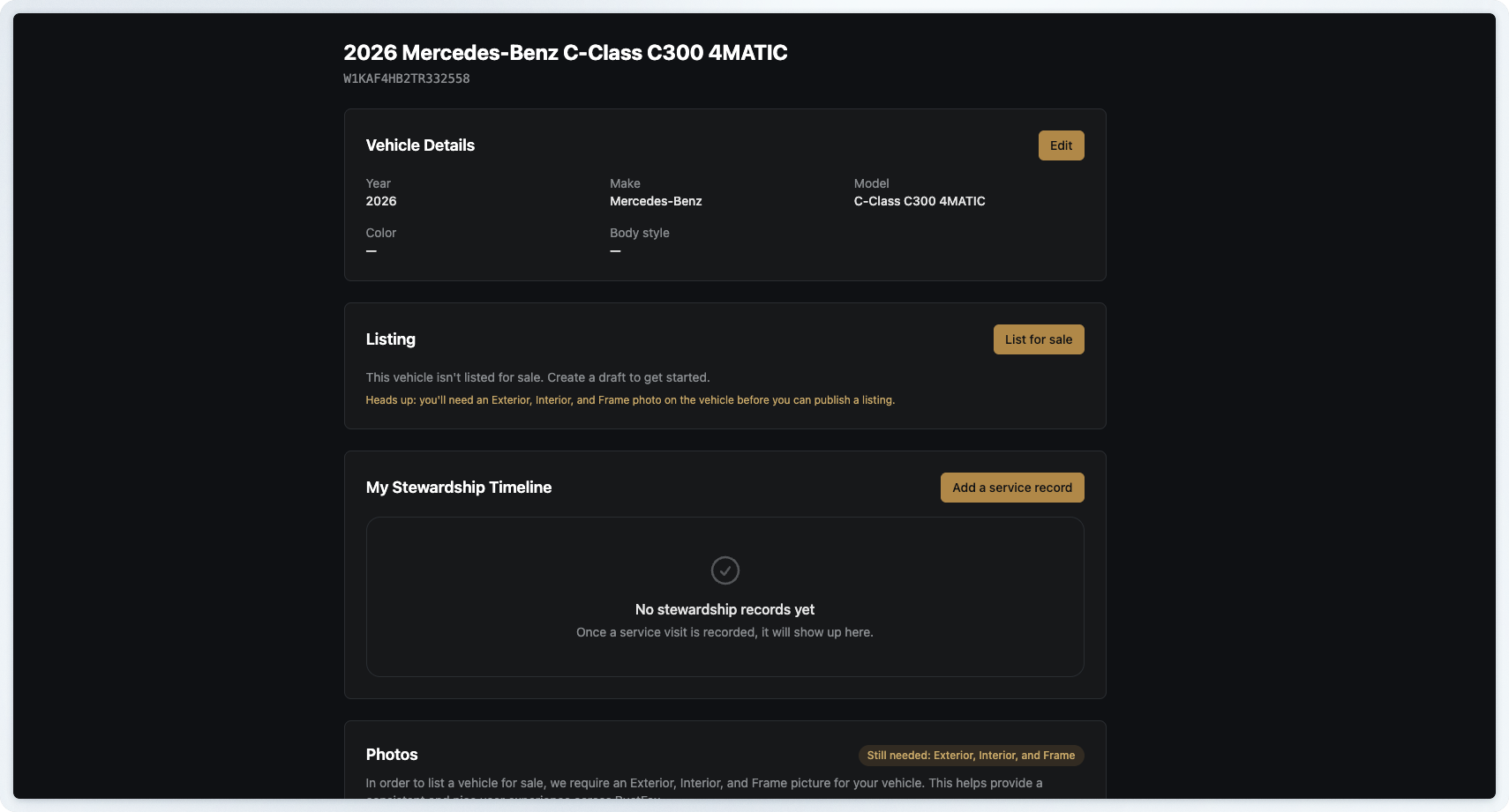
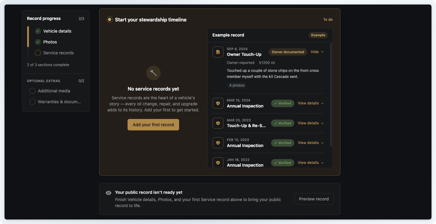
We rebuilt it into small, focused sections with a progress rail down the side. Each section is a container with a clear job — it opens when there's work to do and quietly collapses once it's complete, with an encouraging note confirming the win. The design language came from our Featured Build pages, which already had the visual warmth we wanted: containers, milestone cues, and copy that talks to a person.
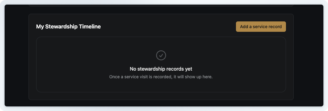
The single biggest thing new users missed was adding a service record to the stewardship timeline, and that one stung. It's the heart of the whole product and one of the coolest features we've built- you can upload a receipt and have AI read the details straight off it.
It was getting skipped for a plain reason: the old call to action was ambiguous, a quiet button beside an empty box that never signaled it was the point of the page.
So we made it the centerpiece. The service record section now leads the page with real weight — copy that explains why these records matter, a prominent "Add your first record" button, and a live example record sitting right beside it so a new owner can see exactly what a filled-in history looks like.
The last surface is the "Add a service record" form, which had grown into a single long form that quietly asked a lot of a new owner. We broke it into digestible, guided steps with progress cues and success feedback, so logging a record feels like moving through a short conversation. One thing we protected carefully: that same receipt-first fast path- upload the receipt, let the AI read the details, and skip ahead. Guiding people is only helpful when it doesn't get in the way of those who already know what they're doing.
Guardrails over guesswork
Most of this work is UX, and a lot of it moved quickly because I leaned on Claude Code with real project context and specific, risk-aware prompting built into the process. That mattered more than the speed. These are key owner-facing pages with real behaviors that had to keep working- receipt extraction, applicator search, warranty handling, and photo uploads. Naming the risks up front and being explicit about what could not break let us reorganize important flows without holding our breath every time we shipped. It fits how we like to work at Planet Argon: give an existing application a second life with modern tooling rather than reaching for a rewrite the moment something feels dated.
Another human guardrail was: I had a lot of opinions! I made sure to go out and survey not only similar websites but also a handful of onboarding flows from some of the biggest companies I could find! Then, when it came time to narrow down the code to a decision, I was careful not to be lazy in prompting. Making sure buttons line up, making sure that text feels right on the page, and being honest about the margins of what a page should do were all important in shaping how the code was directed to be written.
What the mission actually taught me
The real lesson had less to do with any single screen and more to do with where I chose to stand. When you spend your days building, you see the product as a collection of features you understand completely. A new user sees a series of doors, and they can only judge each one by whether it's obvious what's behind it and whether opening it feels worth the effort. Walking the whole journey in their shoes revealed problems that no individual ticket ever would have, because they lived in the seams between screens rather than on any one of them.
If you're improving a product in public, it's worth periodically dropping everything you know and taking the first step as a stranger would. My Steward Registry was already full of features worth finding. What we hadn't finished was clearing the path to them. A feature nobody discovers might as well not exist, which makes that path worth as much care as the feature waiting at the end of it.