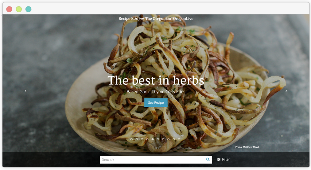
Just in time for the holidays, we are excited to announce the launch of the new Recipe Box by Oregonian/OregonLive; a redesigned, responsive site that allows users to easily search and find the publication’s collection of recipes.
It’s More Than Just a Collection of Files
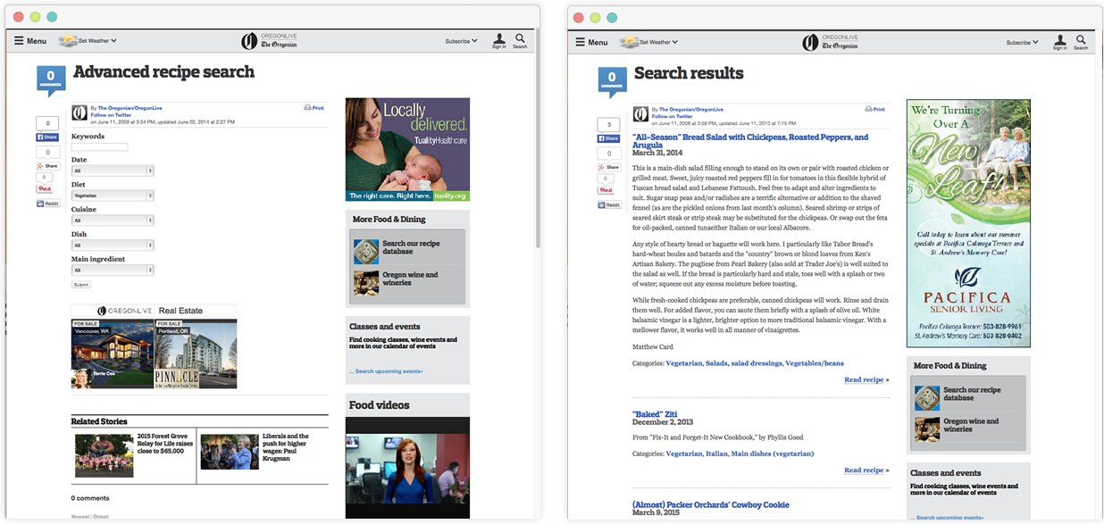
When The Oregonian/OregonLive approached us, it was clear they had reached a limit of flexibility on their platform. Mirroring the print version of their Food Section and complementing the media’s food blog, they had maintained an online directory of recipes that have been curated since 2007 (this meant more than 3,600 recipes). But the online experience was compromised by an inflexible structure, leaving readers with little ability to filter and search for a specific recipe, and an experience that lacked any visual engagement or ability to explore the full potential of the database.
Here are a few screenshots of the site before the redesign

In addition, the existing platform couldn’t provide SEO-friendly URLs (as they were all at the same URL with a querystring id to identify the recipe); which made it extremely time consuming (if at all possible) to try and measure traffic on the site across all their recipes. It also limited the ability of their users to share those recipes on social media and track those shares.
The Plan for the New Microsite
It was clear after our first meeting that there were three parts to this project:
- A new site map structure
- A redesign and development of the microsite
- A new CMS to bring it all together
A Structure to Support Sharing and Exploring
To build beyond just a filtering tool and recipe list, and promote discovery, exploring, AND also SEO-friendly URLs, we wanted to build a site that had three levels for the recipes to really shine.
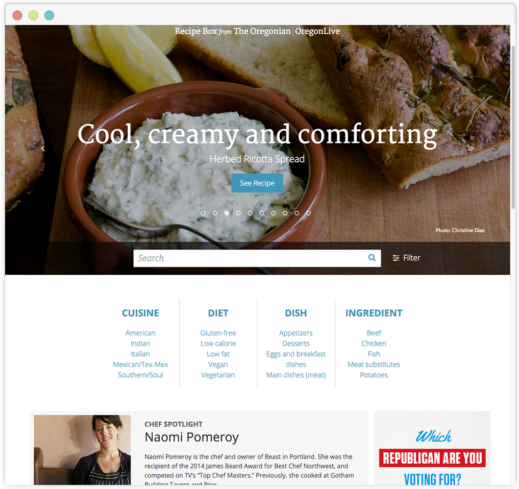
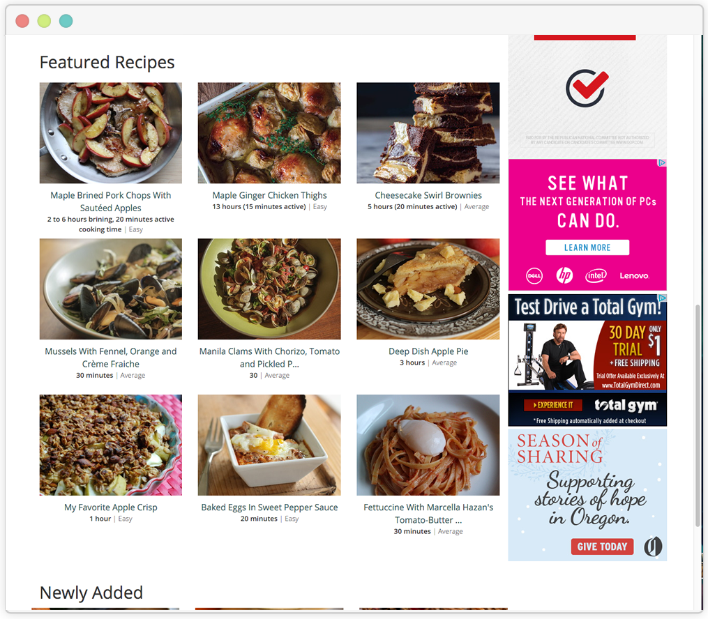
- A homepage: to promote and feature recipes, events, ingredients, chefs and writers to encourage people to browse, but also keep the search functionality up high
- Landing pages that can be curated by staff to feature specific types of cuisine or ingredients
- Which all leads to the recipe itself; which for the most part already existed but we wanted to create a canonical URL structure for all recipes, as they could exist under multiple levels
Designing a Virtual Recipe Box
For the public-facing view there was a lot we could imagine and, lucky for us, there’s also a lot of competitor analysis out there, with recipe sites flooding the interwebs. So we weren’t short on ideas. The one caveat, there was no real analytics on the current site which meant we didn’t know much about how their current readers were using their site. On the upside, a recipe site on the web isn’t a new tool for most, and we did what we could to talk to users in general about how they might search and use a recipe site (I mean, who hasn’t searched the web for the best Thanksgiving pie recipe?) With the site map in place and ideas listed, we could focus on the main goals of the site – to encourage searching, exploring, and sharing – and also highlight what makes this recipe box unique – locally produced recipes are tested thoroughly by the staff’s test kitchen to make sure they’re accurate and easy to follow, giving home cooks confidence that they don’t have to have a James Beard award to be able to pull off a spectacular dinner. A few elements we wanted to make sure we designed:
- Allow readers to easily search and filter on recipes
- Create ways for the Oregonian/OregonLive staff to curate content (like by season or event)
- Highlight authors of content, whether a local chef or writer, so readers can connect (and explore further)
- Connect content in meaningful ways to promote exploration
- Allow readers to easily share their recipes with others
- Show relevant information to readers
- And above all, make the design responsive – because users are likely using their phone or tablet when they are actually making the meal
In addition to the UI design, we wanted to incorporate a visual design that highlighted the food, instead of standing in its way. Without any style guide in place, we could take the ball and run with it, and landed on a minimal design that was clean and thoughtful, but also worked with any sort of image alongside it (or in some cases – no photo!). Simple iconography and typography complement the style.


The CMS to Support it All
With the new design on its way, new requirements and needs were defined for the CMS. It couldn’t be just content blocks anymore feeding out lists of data. Now recipes were connected to people (authors and chefs), ingredients and categories, and could be promoted in different ways whether a hero on the homepage or a featured recipe on a category page. Homepages and landing pages, while relying on some automation of pulling “tagged” or featured recipes, had some level of curation for staff members to highlight specific types of recipes and people.
Using a bootstrap theme as a framework, our development team crafted a CMS that allow admins to add their recipe content (like ingredients, instructions, nutritional info, photos, and ratings like level of difficulty etc) and connect them to categories of cuisine, diet, dish or main ingredient, link them to authors, then choose whether those recipes would be featured. Then they can add in their author profiles, choose recipes to feature in carousel homepage, even edit, add to, and manage their categories and filters (a feature they could not do with their old platform – ie. as they noted, Asian food does not mean grouping all foods from Asia into one category).
Takeaways
This was a fun challenge for our team, and it was great to work with a local partner we’ve all encountered one time or another. From reimagining how a reader might interact with the site or how an admin might curate content, to adding a brand new visual design layer, to seeing it all come together. One thing I’ll miss is seeing lovely food shots on the screens of my colleagues everyday as they worked on designs and implementations (or maybe I won’t, it always made me hungry).
So….what are you going to make?
ps. Here’s the write up from our client partner at The Oreognian/OregonLive: Introducing Recipe Box, a whole new way to access recipes from The Oregonian and OregonLive