Earlier this year we helped our partners at Screaming Circuits launch a new web application using Ember.js as the client-side framework. In this project, we designed and implemented a more robust quoting engine and account service center, integrated support content into a helpful, organized resource center, and allowed for more engaging marketing content to tell the Screaming Circuit story. This post dives into the project’s needs, solution, challenges, and takeaways.
Their Story
Screaming Circuits is a manufacturing company that specializes in building short-run prototype PCB boards. What’s that? Here’s how Screaming Circuits describes what they do:
We build electronic prototypes. So for every electronic device you see, it has a circuit board on it. The circuit board has a lot of little tiny parts on it. [They] put those parts on the boards.
And for every device, it’s likely that prototypes were made of the circuit boards, to test the product and see how it works, before manufacturing hundreds, thousands, or more. Screaming Circuits is the manufacturing team that creates those prototypes, some in less than 24 hours. To that end, Screaming Circuits has helped companies around the world, with “boards that have gone up into space, down into the ocean and everywhere in-between.”
“Picture a 10 year old storefront…”

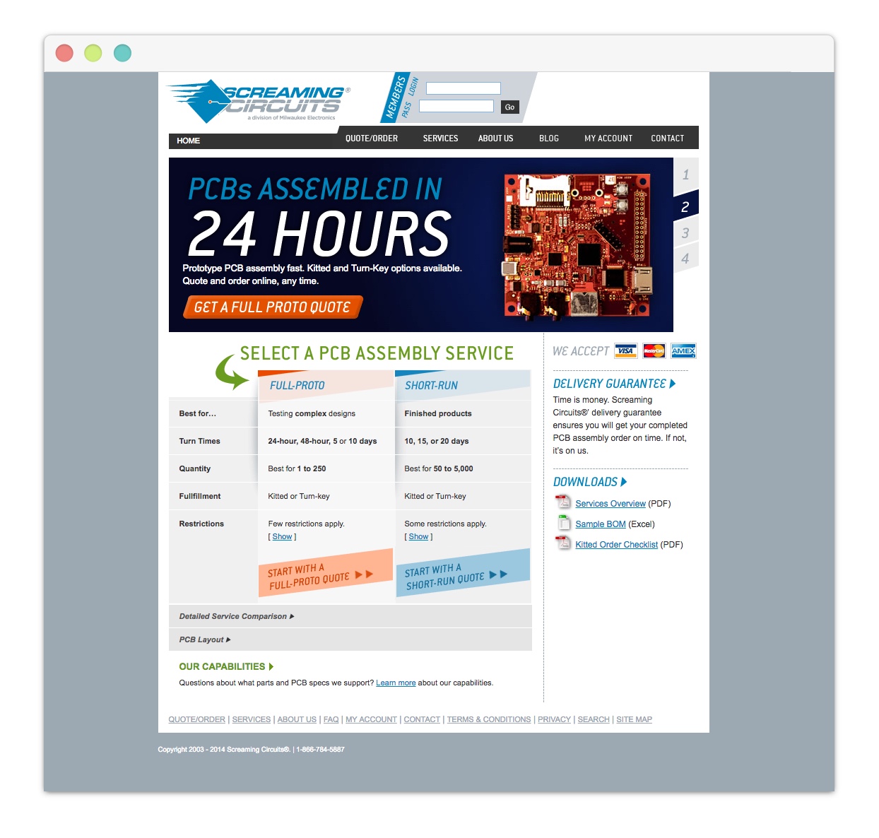
This was how our partner at Screaming Circuits described the service need they had prior to us joining forces to redesign their web application. While Screaming Circuits was one of the first in their field to offer an online quoting system, it hadn’t been updated in over ten years. Their storefront needed a complete overhaul.
Further complicating the problem, their data was stored in different databases that didn’t connect seamlessly to each other, which meant managing information in multiple places and sometimes manually connecting them. In order to remain competitive, they needed to improve their systems and workflows and increase integration with the services they provide.
To address this, the Screaming Circuits team decided to move off of their .NET framework and engineer a more integrated database structure, which would better connect their customers to their online orders and quotes. They also prioritized integration with their customer service engine to avoid multiple data structures, which would create a more robust application for customers.
With our team helping to design and implement the client-facing application, we began to explore frameworks and processes that would serve SC and their customers.
Defining a Roadmap
After our discovery session with Screaming Circuits, we identified five areas of focus:
1. The Quoting Engine
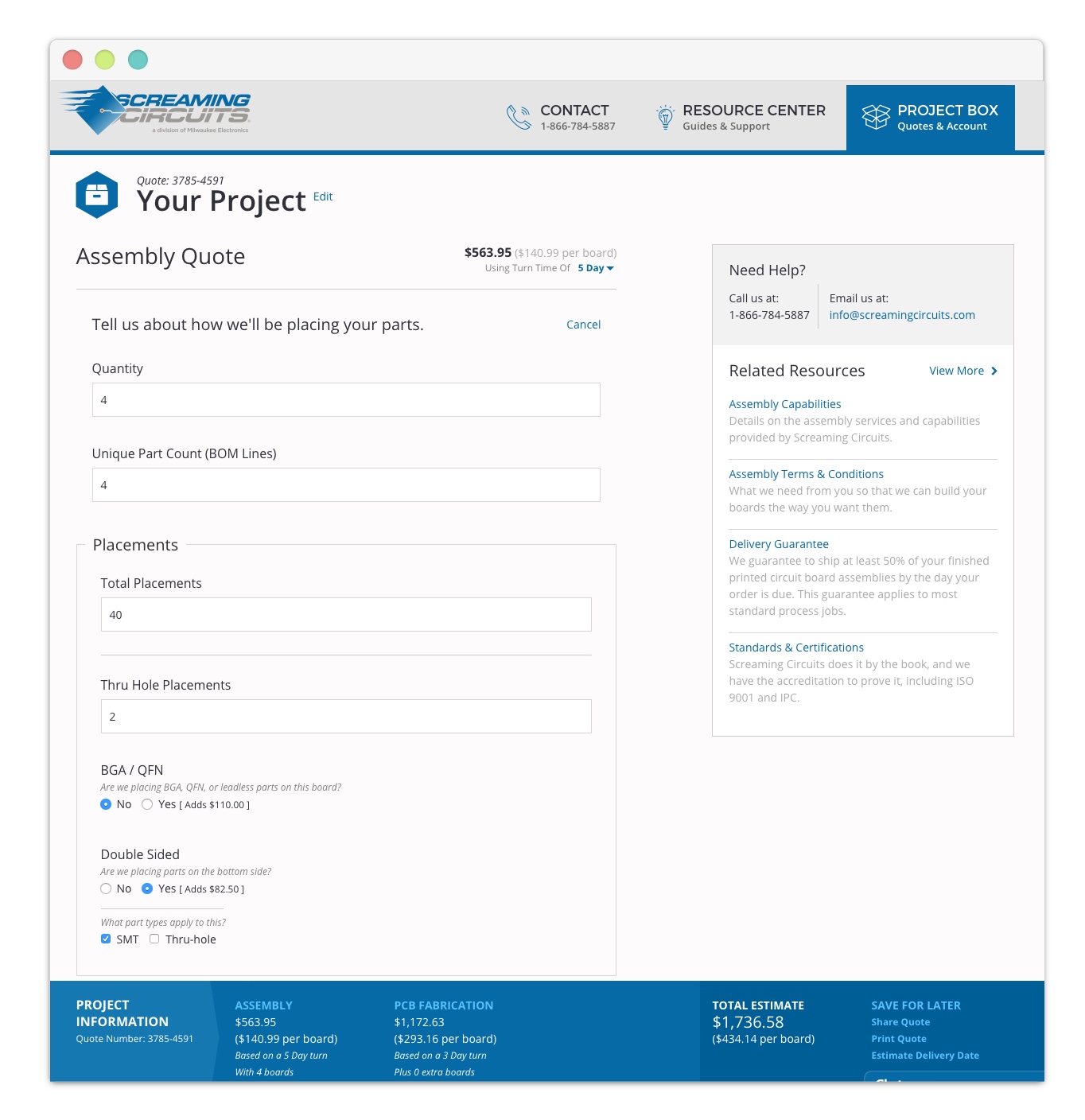
This was the biggest and most complex part of the application as it allowed a customer to customize an order from fabrication to parts sourcing and assembly.
The three steps involved very precise specifications that, when changed, could alter (or invalidate) previous configurations, price, and turnaround time. We knew that a smart form that updated in real-time, although complicated to build, would be the best experience for the customer.
We also wanted to make the entire process accessible without an account. In the original quoting engine, the assembly step was public, while the rest of the process (fabrication and parts sourcing) was only accessible when logged in. Making the entire process easily accessible would allow users to comparison shop and find the best value, while giving recognition to Screaming Circuits as a one-stop resource, as opposed to just an assembly shop.
2. My Account
The customer’s account area displayed only the basics about orders and quotes. In early conversations, we talked a lot about the “2-week black hole” customers had to endure as they waited for their prototypes to be delivered, sometimes making anxious phone calls to check on order status. We wanted to open the curtain and be as transparent as possible.
To do so, we created an informational dashboard where a customer could better track an order, get updates and alerts, and engage in real time with Screaming Circuits.
3. The Resource Center
We knew that Screaming Circuits, after 10 years in the business, were domain experts. Unfortunately, their old site did not reflect this. It lacked the connection to resources and information that one would find useful.
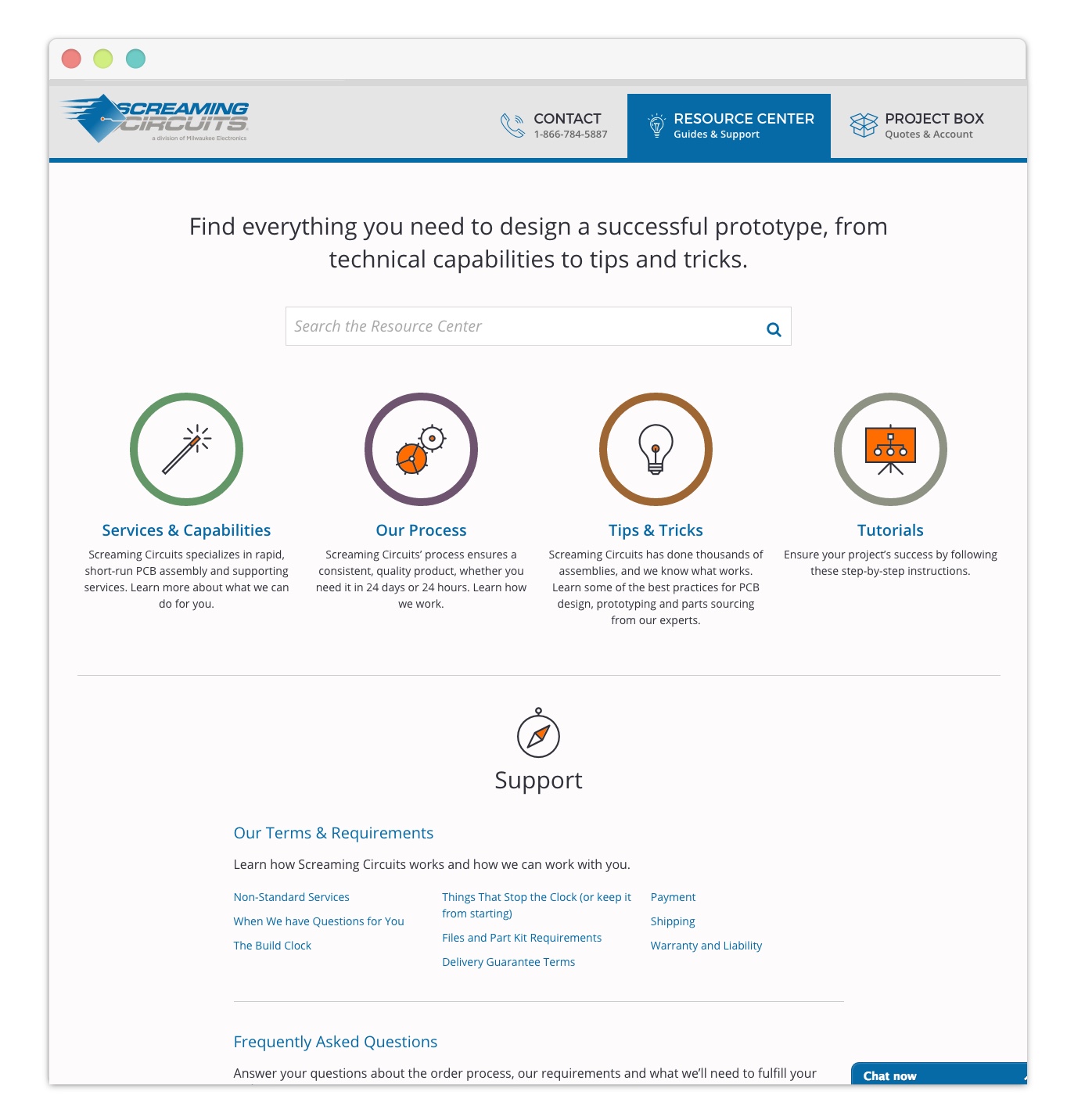
For the Resource Center, we envisioned a cohesive repository for all support documents and helpful information. We wanted the how-tos and best practices, the “did you knows” and “don’t forgets!” all in one area, instead of scattered in blog posts and tertiary pages. This information needed to be indexed and categorized to give current and future customers the information they needed without having to hunt it all down. This additional area keeps Screaming Circuits top of mind as the “go to” people.
4. Marketing Content
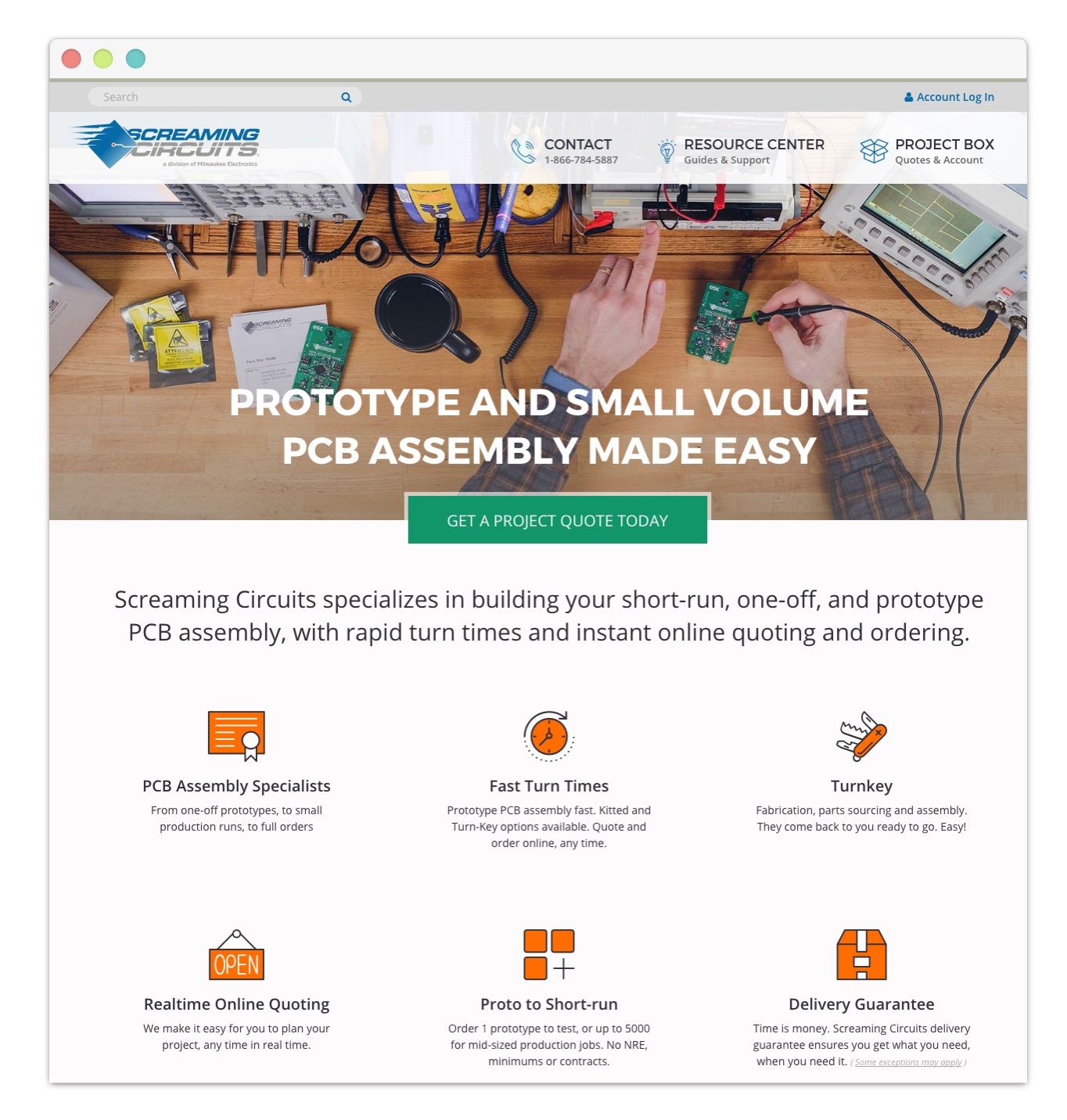
The first priority of the new site was to build an online quoting engine and enable Screaming Circuits to manage that information. The second was to reflect domain expertise. The third priority was to create a place for SC to tell their story, free of confusing technical jargon. The marketing pages became an editorial storytelling area, where the company could provide information and paint a better picture, with photos of their team and company, of who they are and the types of projects they work on.
5. Modern Tools
Screaming Circuits was adamant about building their application with a modern, cutting-edge framework. The imagery of a rocket ship was used more than once to describe the end goal. They were proud of their history of pushing the industry forward with their previous customer interface and wanted to improve that experience.
A one page application framework – Ember.js
Early in the design phase, we began to look at different frameworks that might be suitable for the job. We needed a toolkit that fit the SPA (single page application) model, ideally supported IE 8 & 9, and would provide the user with the experience they have come to expect from native mobile applications. This includes live input updates, background data validation and template transitions without window refreshes in the browser.
We chose Ember.js primarily for two reasons: it supported the required IE versions and the Screaming Circuits technical team would be able to take over active development post-launch. The strong conventions and patterns within Ember.js provided a solid roadmap to better facilitate this transition.
What we learned
We always learn a lot while working on a project. Here are a few of our takeaways from this one:
1. A design sprint would have been handy
The quoting process was a lot bigger than we initially expected. We had not yet started our design sprint workshops at that time, but the quoting process would have been a prime candidate.
Why? Although we worked closely with SC on designing, we isolated ourselves from the broader group, and went down several paths before settling on a straightforward direction. We also wanted to get user input. Due to the complex logic of the form, we weren’t sure if a prototype could give us the feedback we needed, and we instead waited for implementation to be done before testing. Due to the complexity of the application, that ended up being a lot further down the road than we’d thought.
With a design sprint, we would have been able to get through a multitude of potential solutions, collectively choose a winner, and challenge it with users. It would have gotten us all on the same page, instead of stuck in isolated meetings and numerous Basecamp conversations. Ultimately, it would have gotten us results quicker.
2. Technical decisions are always easier in hindsight
There were several early decisions made about how the state of a page was maintained and how a user’s interactions were reflected in the URL that required more thorough consideration. Certain aspects, like what happens when a customer refreshes the page, or how we ensure returning users don’t repeat previous steps, need to be given the attention they deserve and can be taken for granted when building with more traditional backend frameworks. This was our first foray into the SPA landscape, and there were issues that, in retrospect, should have been addressed earlier.
3. Iterations don’t always work
Our normal ‘iterative’ workflow didn’t work very well for the development of the single page application. Previously, we would break the application down section by section, each with its own iteration, from design to front-end to backend.
This proved to be a bit more difficult with a single-page application due to how closely the ‘backend’ and ‘front-end’ developers needed to work together. Previously, their roles had been defined by our experience working with Rails and other server-side frameworks. Transitioning to client-side frameworks meant that the front-end got far more technical, while the backend developers needed to get more involved with the HTML & CSS.
4. Removing the page refresh gives you a lot of new design decisions
With Rails (and other) applications, we can rely on the page refresh within a form to communicate to the server and return the result of whatever the user has submitted. With Ember.js, that communication is asynchronous and happening in the background all the time. Which means, we can know halfway through the form if the user is attempting to insert wrong data. Sure, you can do that using AJAX but this is something that is straight out of the box with Ember.
This can be a blessing and a curse. Every page transition or state that the user may interface with can be tweaked to react the way you want it to. Answers are simple with a page refresh. You click the ‘next’ button and get to the next section of the form. But answers are not always quite so simple with Ember because you are faced with more design decisions that you may not have had to think about before. For example: how transitions should work between sections of a form or button error states.
For that reason, we found that design was always being discussed and discovered throughout the project. It wasn’t quite as simple as handing over flat photoshop files.
End Result

The new Screaming Circuits site is a clean, responsive, and robust application that provides the necessary functionality in a dynamic and engaging interface.

The quoting engine now allows a user to complete the process seamlessly on one page, while making real-time adjustments to see how it affects cost and turnaround. This completely new offering allows the customer to see the full service capabilities that Screaming Circuits provides.

The Resource Center is now a collection of all support documents, guides, and tutorials. Consistent page templates give the Screaming Circuits team the ability to add more information and keep content organized and clear in the future.
The biggest improvement to the app is scalability and sustainability for the Screaming Circuits team. The redesign was the first step for SC to fully integrate with their customer service channels and improve the disconnectedness of their data. The new site also allows Screaming Circuits to add enhancements in the future like real-time alerts on orders and messaging.
While it’s still early to tell by analytics, we have heard from our client partners that there has been a significant increase in users acquiring quotes, ordering for the first time, and full turnkey orders. Mobile usage has also grown significantly! Great news for their company and customers, and for us to see our solutions working. It was a privilege to be a part of the team to build a foundation for Screaming Circuits to truly step ahead, and it will be exciting to see how the site develops and grows from here.
For more Ember tips, here are a few articles we wrote based on our experience in this project
Ember.js vs. Angularjs: Comparing Apples to Oranges
Simplicity vs Maintainability: “One Model, One Endpoint” with Ember data