Every year, Planet Argon releases a retrospective compiling the past year’s events; this includes business accomplishments like app launches, and personal milestones like marriage and travels. A couple months ago, I, Jack Bouba, was tasked with getting the ball rolling for the 2012 Year in Review. I felt this was right up my alley because (1) I love being in charge and (2) I’ve been rolling balls since childhood.
In one of our initial meetings, we chatted about different ways to engage the user; specifically, to lead a viewer down a narrative path. We grabbed our tools (a bottle of scotch) and got to work. Ideas flew like bricks: giant infographic, faux newspaper, virtual storybook, message in a bottle, body painting, opening a new fifth of scotch – all of these themes had potential, but none stuck. We toyed with the idea of using a JavaScript library like Joyride, Scroll Path, or TimelineJS, all impressive plugins that handle sequential progress in different and interesting ways, but eventually we decided to utilize video as our storytelling medium. Partially inspired by the lovely and simple Kickstarter Team page, we thought it’d be a fun challenge to tell our chronicle of 2012 using both video and text elements. With the addition to our tool belt of Tubular, a simple plugin that expands a YouTube video to the full width and height of a browser window, our plans were beginning to solidify.
We would record a ‘one shot’ video of the Planet Argon team reenacting the major events of the year. We’d spend 30 seconds or so miming the actions of a particular month-including going on vacation and exchanging Valentine’s Day balloons-then we’d pause momentarily and move on to the next month. The 2012 Year in Review would feature the video as a full-bleed page background, and our actions which would sync up with the page content for the individual months.
Here are a few of the interesting challenges that we faced:
- Will everyone show up on the day of the shoot with the required attire?
- Will the YouTube API be the death of me? (This requires a much more technical explanation and will therefore be analyzed in a separate blog post – you’re welcome)
- How do we want to serve devices that don’t support Flash / wouldn’t display a background video?
- Will a dozen people holding sparklers in the conference room yield undesirable consequences?
- How can we link to our blog posts without prematurely leading the viewer off the page (as in, before completing the video)?
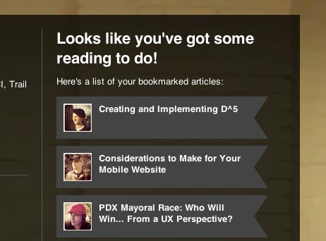
I think our approach to addressing that last challenge was pretty interesting and hopefully effective. We decided to handle the concern of not disrupting the narrative experience with blog links by implementing a reading list feature. If you happen to see an article description that catches your attention, simply click or tap the block, and the link gets added to the customized reading list waiting for you at the end. We didn’t want to distract the visitor from the immersive video experience; we hoped that a viewer would explore the photos within a given month, save a post or two for later enjoyment, and continue on to the next month.

Also, if you’re interested, there was indeed one person who forgot to bring his/her Summer Picnic t-shirt. If you watch closely, you might just catch someone uncomfortably removing an outer layer of clothing in August to reveal a form-fitting XS t-shirt. Bonus points to the individual or individuals who write this team member’s name in the comments.
Of course, there were many more questions to answer and riddles to solve before we were finally ready to launch our Year in Review page. The project was quite a challenge and ended up being a bit more time-consuming than we’d anticipated, but it was also great fun getting the entire team involved. There’s something magical about seeing yourself on the big or little screen, and it is especially gratifying to watch yourself executing something difficult, like acting out an entire year of activity with your colleagues in one very important take.
We’d absolutely love to get some feedback: So, what’d you think? For the developers out there, would you have used the HTML5 video element? How attractive do you find us, as a team, on a scale from 8 to 10? Do you think the bookmarking feature helps or hinders us in our desire to share our writing? If there’s anything else you’d like to share with us, we’d love to hear your comments, critiques, and suggestions.