A flashy homepage means nothing without clear goals. Here’s how to make the right things matter first.
7 Jan 2026
3 Jul 2025
9 May 2017
18 Apr 2017
If you're anything like me, you've spent several hours of your life scrolling through Medium articles. From think pieces to bold proclamations, to tear downs of other Medium articles, the network is home to some amazing (and not so amazing) content. But every once in a while you come across a piece so well-composed, engaging, and informative that you have to share it and get others opinions on it as well. For me this month, that was this article from Issara Willenskomer on motion-based UX design.
In it, Willenskomer breaks down how motion supports usability, then dives into 12 individual principles, like transformation (a circle evolving into a square, for example), and overlay (a foreground object sliding over a background object) to name a few. Each principle has detailed descriptions, along with gifs to demonstrate the motion on a website or app.

If you're a designer, you might not agree with all of the principles described in this piece. But odds are, you'll find a bit of inspiration and may want to bookmark this one for later. The next time you're thinking on movement for a new design, try giving this another read through.
What are your thoughts on the 12 motion principles described above? Leave a comment and let us know!
24 Jan 2017
18 Oct 2016

The best clients are the ones that trust our expertise and seek our input on ideas, but aren’t afraid to poke holes when needed. They collaborate on ideas without pushing their needs over those of their users. They also make time when needed. But I’d argue luck has nothing to do with having a great client. Rather, it’s how you enable them to be great. And as a designer, that’s an important part of my role in a project.
25 Aug 2016
A great article asking designers to not shy away from asking questions that will help clients get to the core of their needs and allow designers to provide valuable solutions.
Watching our designers at Planet Argon work, I've been lucky enough to be first-hand witness to what this article outlines any designer can do for clients. Watching them listen to client and project needs and thoughtfully provide proven solutions makes participating in projects that much more fun.
1 Jun 2016

Our work with the Portland-based Meyer Memorial Trust (MMT) recently launched and the first applications to enter its new system are making their way to MMT this month! In this post, we wanted to share our process for building the grant management database, the lessons we learned, and the result of almost three years of working together with MMT.
27 Apr 2016

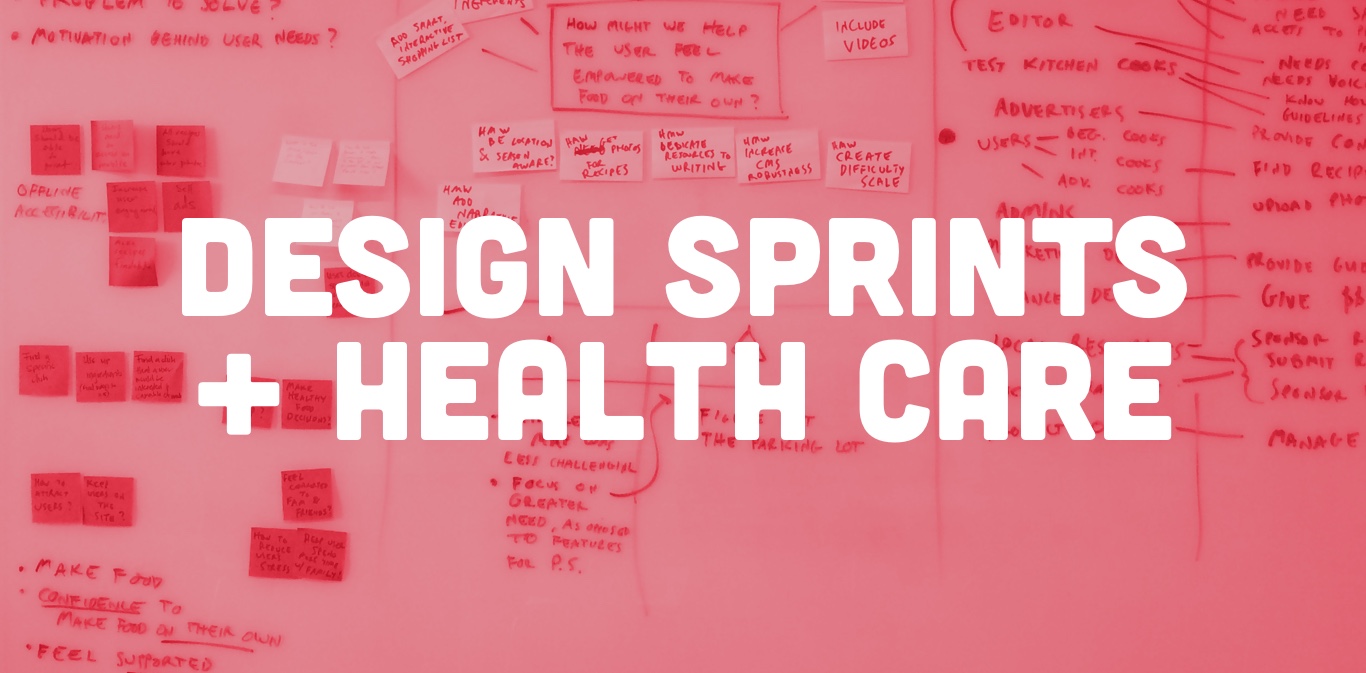
Over the last few months, we’ve added Design Sprints to our toolbox; working through exercises to help us define problems, goals, and solutions. A design sprint can be used in any project but I’d like to specifically talk about how it can help with a legacy health care application.
31 Mar 2016
Steve Suo and Grant Butler from the Oregonian/OregonLive share their experience of working with our team and the results of our redesigned Recipe Box; from a more inspiring and searchable application, to an increase in traffic, to simultaneously freeing up their staff time to focus on the content they serve to customers.
Have a project that needs help?