Our home for four days. Picture provided by Cooper Journal Photos.
At the beginning of this month, I was fortunate enough to attend the Cooper UX Boot Camp. What is unique about this course is that Cooper partners with a non-profit to identify a need they have and, in turn, give the class a real-world problem to work towards resolving. In the end, teams may “compete” for the best idea, but everyone walks away with a clearer idea of the process and the chosen non-profit walks away with all of the ideas to use or think about AND a donation in the name of the winning team.
I was both excited and nervous about this opportunity. I knew that Cooper was considered an expert and leader in UX. Alan Cooper’s acclaimed book About Face 3: The Essentials of Interaction Design and Kim Goodwin’s excellent guide for Designing for the Digital Age: How to Create Human-Centered Products and Services sit on our bookshelf in the studio, waiting to give guidance and ideas to problems we face. In fact, before I even started here at PA, About Face 3 was one of the books I was given to prepare for the job. All of this is to say, the folks at Cooper have a solid methodology and thought-process that I wanted to learn and absorb. I also wanted to meet more like-minded folks in my field, hear about their experiences, and maybe learn a few things from them too. Plus, the non-profit chosen was Women’s Earth Alliance, and after a quick look at the work that they do, I was even more confident in the choice to go.
My goal was to implant their tips and tools into my head (or maybe just have scrupulous notes that I could could reference), so that as I work with our clients I too could have a solid methodology, albeit customized to our environment, but consistent from project to project. No more recreating the wheel each time. Note: this goal is a lot more intelligent than what I sputtered out the first day when everyone was asked to stand, tell the class who they were, and why they were there. Cie la vie.
So, did I reach my goal? I think overall, I did. Here are a few tidbits that stuck with me:
Lessons I Learned
1. Stay focused on the user and their scenarios:
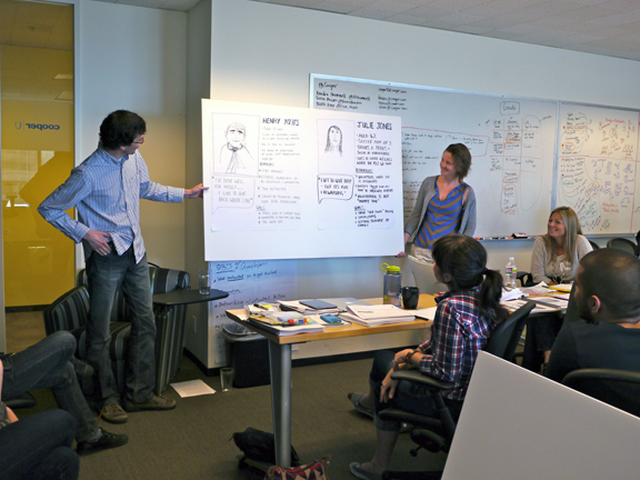
Our team, The Currents, talking about our two personas, Henry Yates and Julie Jones. Picture provided by Cooper Journal Photos.
We spent a lot of time prepping ourselves before we even began to think about concepts. While I’ve been good about doing due diligence before I jump right into design, I don’t think I always kept the focus straight, and part of the reason is that I haven’t done enough to map out where we are and identify where we and who we want to be. I confess. I have designed a few things that weren’t entirely necessary. Yes, maybe some of them have even been out-of-scope. Had I focused on things like a core persona and identified their scenarios, I probably wouldn’t have found myself defending unnecessary interactions and designs. Which leads me to the second thing I learned…
2. Learn to ask “Why?”…Learn to answer “Why?”:
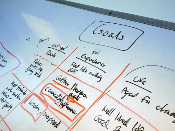
Understanding the goals and experiences of the WEA users. Picture provided by Cooper Journal Photos.
This actually is going to become my new mantra of my job. When someone asks, what do you do, I’m going to say “my job is to ask why and answer why”. A lot of the exercises we did, our instructors wouldn’t allow us to just give a comment and not explain why. “Why do you not like that image?” or “Why do you think this is important?” And there’s a reason behind that. They weren’t being difficult. They wanted us to understand the meaning behind our ideas and opinions. Or force us to think about the user’s perspective and opinions. I realized how essential this is throughout the process, whether it was when we were interviewing stakeholders and users, researching behaviors, or soliciting feedback. Never let someone get away with not answering why for you. Being able to ask why is essential to understanding what the problem is and how you can solve it.
And likewise, never be sure of your idea until you can answer “Why?”. “Why do I think this?” or “Why is this important for the user?” Answering why forces you to remember your personas and their goals and confirms whether your idea is accurately meeting those needs. There should be a nice dotted line from your design to your core persona, showing how it relates. Doing this can solidify your belief or maybe move you along down a better path. Just like I mentioned above, I have definitely been caught adding features that weren’t needed. Had I forced myself to answer why I was adding it, I might have realigned with the goals and realized it wasn’t really needed. For those design ideas that do match, having that solid alignment makes answers to stakeholders that much easier.
3. Don’t use metaphors to describe your design:

This was the last slide of our presentation…
UFTA. Our team’s ideas and our pitch was chalk full of metaphors. Our idea was to share stories by skipping the “story stone” to another person. Now, I’m just going to say off the bat, I don’t blame us. We were convinced ahead of time that “metaphors would resonate” and so we made it happen. And to play devil’s advocate, I don’t think the advice was bad. It did seem to resonate with the client, they felt “moved” by our ideas and I think it hit a personal note and made them much more receptive to the idea. Maybe part of that was because we were learning how to address the audience.
That said, I get the advice we got from Mr. Alan Cooper. “Metaphors are sh*t” (Ok, I might be paraphrasing) “Metaphors are used when you have a bad design”. I don’t disagree. I think ideas should stand on their own. They should be clean, concise, and to the point. Noted Mr. Cooper.
There were more things I learned, and I’m sure as time goes on I’ll find myself remembering a nugget and referring to my book and handy flashcards. But there were also a few things I wish I knew ahead of time. Here are a few tidbits that would have been helpful before (aka, If you are thinking about attending the class, I have some advice).
What you should know:
1. Know what you’re getting into:
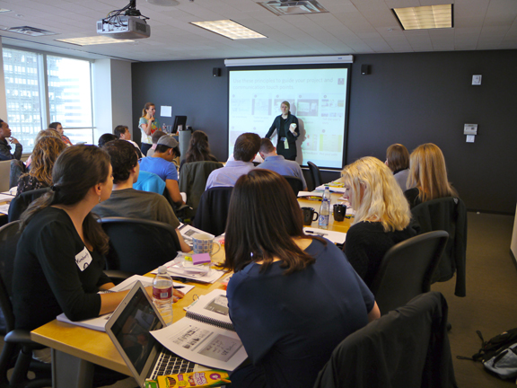
The first day of our UX Boot Camp. Picture provided by Cooper Journal Photos.
I think because of the inherency of the class, some people come to boot camp hoping to just get an overall idea of UX. But what this means is that some may come to the class not knowing a thing about UX or what’s involved. I’ll admit, I learned a lot of new things, but I had a pretty good understanding of what I might be missing before I stepped foot in the door. While we made it out in one piece, I could see there were a few people struggling, and I wonder if they left just as confused or if any of it sunk in.
But beyond my concern of their retention, this varying level of knowledge also meant some folks needed a little more help. The instructors were very willing to explain further, but unfortunately time management became sort of an issue (down to blaring alarms going off when our short assignments were due and parts of the course being skipped due to lack of time). So keep that in mind – you can’t control who’s in the class and nor can the instructors.
2. If you want in-depth this is not the class for you:

I used to take a boot camp class. Each morning, the instructor had created a series of exercises to go through, never focusing on one type of exercise for very long, never targeting just one muscle group. In one class she might have us run a few blocks, do a set of pull-ups, do lunges across the floor with weights, hold plank position for a few minutes, have a round of tug-of-war, and do my least favorite, burpees.
While Cooper did not make us do any burpees, the name they had given this course is spot on. The UX Boot Camp is an intensive course on UX; from research, to design strategy, to the pitch, and everything in between. With limited amount of time, there is no way they can focus on one topic. So if you are looking for help in say, visual design, and really want to focus on that, check out Cooper’s line up of classes before you commit. You’ll find yourself wishing you had when you skim through the topic in boot camp.
3. Be smart about what you intend to get out of the class:
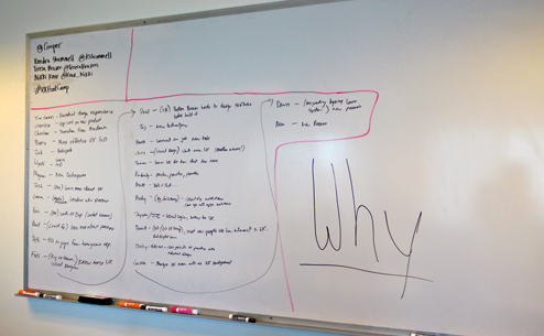
The first thing our instructors had us do was to stand up and tell the class why we were there. Picture provided by Cooper Journal Photos.
There’s a lot to cover, but if you stay focused on why you are there, you’ll likely walk out of there with just what you need in your own setting. I was not good about this, I’ll admit. I found myself caught in the moment working on our project and not taking the time to relate back what I was learning and how I could use it. Luckily, they do supply you with a lot of printed materials, so hopefully, if you are like me, you can refresh from time to time.
4. Be smart about who you think you might get that from:

Think of Sherlock Holmes; the CSI gang. Be observant of the people in your class and try and figure out as much as you can before you take your seat. Sure, it’s hard when everyone around is new. You don’t know what experience they have in UX and what they bring to the table. Had we all walked around with a presentation board of our persona, this might make this whole thing a lot easier. As the oblivious person, you may just sit down next to the person that looks nice or you sit down at the first available seat. Whatever the case may be, you should know, the people around you are likely to be your teammates. Some were lucky with their seat selection, and others, not so much. While there is something to be said about learning to work with different types of people, you also want to make your short time there worth it. Get to know people as you get breakfast before class. Learn what brings them to the course. Look for the people who seem to be engaging and enthusiastic. Avoid the people who look distracted or are sitting quietly in the corner. More often than not, the people who attend these are just as enthusiastic to be there as you, but you never know. And if you really missed out, you are given a chance to switch teams later. However, that comes with its own issues, so avoid it if you can.
The Result.
Whatever the case might be that brings you to Cooper’s training course schedule, I fully endorse it. It’s a great experience. The instructors are extremely helpful, you meet interesting people, and no matter what, you’ll walk away with something. If you’re interested in the Boot Camp, you can read about the class and our results in Cooper’s blog. And if you think you’d like to try it out, the next Boot Camp is on Alan Cooper’s 50-acre organic farm in Petaluma (PRETTY AWESOME). You can even win a spot by designing a poster.
Or if it’s another class you’re after, here’s a link to their training schedule.
Just choose wisely, and when you do, be vigilant in what you hope to get out of it.