🚀 See the 2024 Ruby on Rails Community Survey results!

Entries tagged: user experience

Article  |  UX

PDX Mayoral Race: Who will win...from a UX perspective?

30 Aug 2012

I know what you might be thinking. This is a post about which Portland mayoral candidate I think might/should win this November. It’s not. I am by no means a political consultant. I don’t follow polls. And furthermore, I never like to talk politics (with strangers at least).

But what I do like to talk about is user experience design. And inspired by this recent article on the mobile differences between our two presidential candidates, I decided to take it local and conduct a quick usability audit on the sites of Portland’s mayoral candidates, Charlie Hales and Jefferson Smith.
Continue Reading

Article  |  UX

What I learned at UX Bootcamp

14 Aug 2012


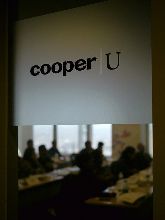
At the beginning of this month, I was fortunate enough to attend the Cooper UX Boot Camp. What is unique about this course is that Cooper partners with a non-profit to identify a need they have and, in turn, give the class a real-world problem to work towards resolving. In the end, teams may “compete” for the best idea, but everyone walks away with a clearer idea of the process and the chosen non-profit walks away with all of the ideas AND a donation in the name of the winning team.

Continue Reading

Article  |  Work

School’s Out...For Now

17 Jul 2012


As Alice Cooper put it so eloquently, school may be out for summer, but it’s most certainly not forever. While kids are busy with summer activities and teachers are taking their much needed breaks, some of us have been busy. With our design help TCI, a K-12 publishing company, released their new online tools for students and teachers, primed and ready for the 2012-2013 school year.

Continue Reading

Article  |  Work

Welcome to the FamilyLink Network!

10 Jul 2012


We’re so very proud and excited to announce that our project with partners iKare has launched! An idea that was more than a year in the making, the FamilyLink connects families and friends to their loved ones through a device that shares photos, videos chats, messages, but more importantly provide an ease of mind.

Continue Reading

Article  |  Work

Creating Contiki's Mobile Site, Part 3: Visual Design

24 May 2012

At this point, we’ve gone through the early stages of our design strategy by researching, sketching ideas, and making a paper prototype. We then extended that strategy phase into a development of a mobile prototype to help explain how each page would function on the site. It was now time to complete the user’s experience by adding visuals to complement that functionality. Thanks to the extra work we did in the beginning, we knew what we wanted to see, so the transition from our quick and dirty prototype to a finished user experience adding visual design elements was practically seamless.

Continue Reading

Article  |  Work

Bringing People Together: The Contiki Community

25 Jan 2012

A community needs a common passion or value, something that brings the members together. The Contiki Community is not about a passion for travel. It’s not about the product either. Much in the same way that you are not simply “buying a tour,” the Contiki Community is about the Contiki experience. It’s about the hunt for the perfect trip, the rush of making the decision and booking a trip, the buildup as you get closer to your departure, the letting go and immersing yourself in a new culture with new people, the high after you return where you can’t stop talking about what you saw and did, and the burning desire to do it again; or rather it’s about all the feelings you have as you go through the lifecycle of doing a Contiki.

Allison Beckwith, Planet Argon, on the design vision for the new community pages

What began as a vision between Contiki and the Planet Argon Team became a reality this week as we launched the new Contiki Community pages.

Continue Reading

Have a project that needs help?