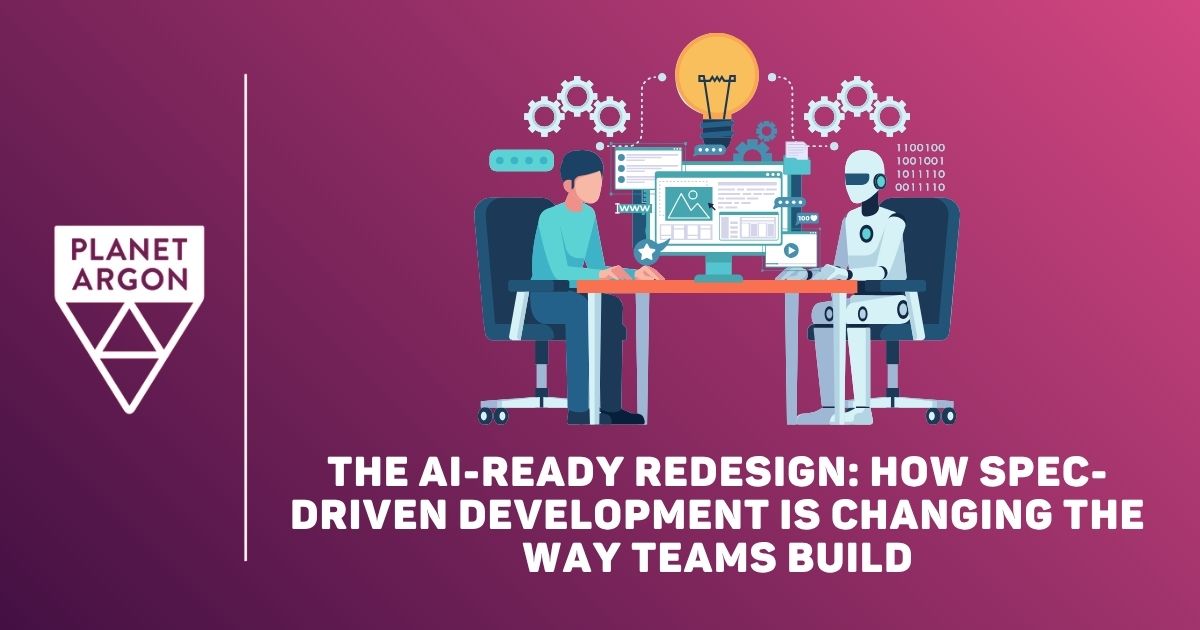
Redesign prep matters, but what does it actually look like when AI is in the room?
![]() The 2026 Ruby on Rails Community Survey is open. Add your voice!
The 2026 Ruby on Rails Community Survey is open. Add your voice!
13 May 2026
16 Mar 2026
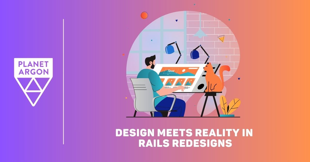
Redesigning a Ruby on Rails application is easy on paper. Making it work with real systems is harder. Here’s how Rails teams align design visions with reality.
29 Jan 2026
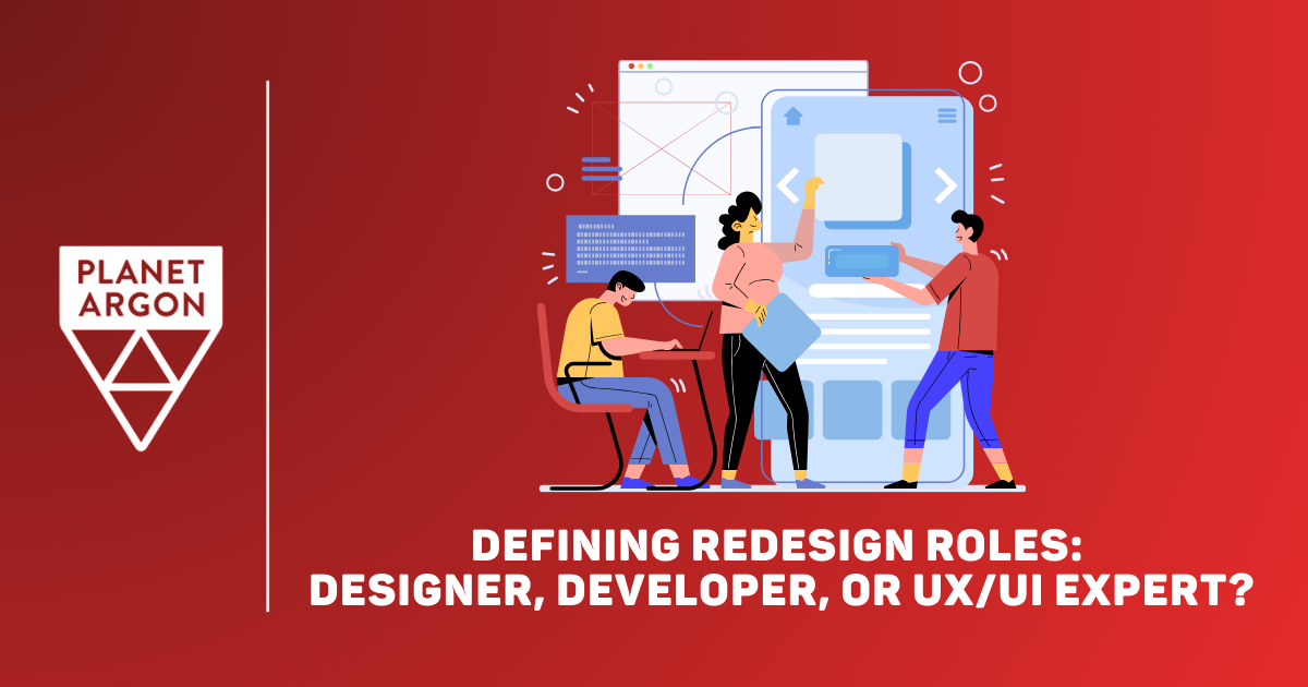
A practical look at why website redesigns stall and how choosing the right lead at each stage keeps work moving forward.
15 Aug 2018
This year, we partnered with Portland Women in Tech to create the data visualization site for their 2018 community survey. The results are now live.
20 Oct 2017

We pride ourselves on building long-term relationships with our clients. Here's the story of how we partnered with an international moving insurance company, Pac Global, to maintain and eventually redesign their app.
21 Sep 2017

We recently achieved the top spot in Clutch.co's list of Portland's Best Web Developers. Here's how that list is created and why we're particularly proud of this accomplishment.
20 Jul 2017

Planet Argon has been involved in the annual Portland Tech Diversity Survey since its inception two years ago. For the second year, we designed and built the site displaying the data from this survey. Check it out!
31 May 2017

Icons are a major part of web design. The right icons can really pull a web page together. Here are 10 sources you can reference when you’re in need of free icons for your commercial site, no matter what style you're looking for.
16 May 2017
Sketch is our design app of choice at Planet Argon. Here are 20 of my favorite Sketch keyboard shortcuts, tips, and tricks to make your design workflows quicker and easier.
9 May 2017
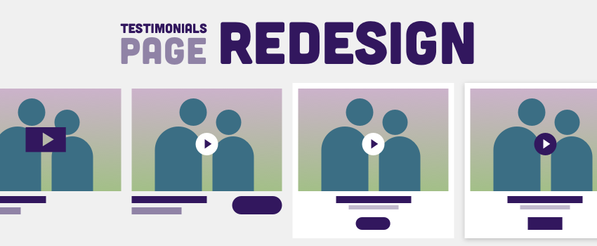
What started as a simple task became a more complicated redesign. Follow along as I go through the entire process of updating our Testimonials page.
Have a project that needs help?